Four directions for the OpsTower mark
All four are built as clean vector geometry, tested down to 16px, and work in a single colour. Pick one as the primary — the Beacon tile can serve as the app icon regardless of which you choose.
Control Tower
The most literal expression of the name, and it earns the Radar / Pilot / Pulse module family. Strongest story, most detail to protect at small sizes.
Single colour · favicon sizes








PNG is transparent. JPG can't be, so it ships flattened onto the background it was drawn for — use the matching one.
Radar Sweep
Circular and instantly readable as an app icon. Signals monitoring and visibility — the core promise — without drawing a building.
Single colour · favicon sizes








PNG is transparent. JPG can't be, so it ships flattened onto the background it was drawn for — use the matching one.
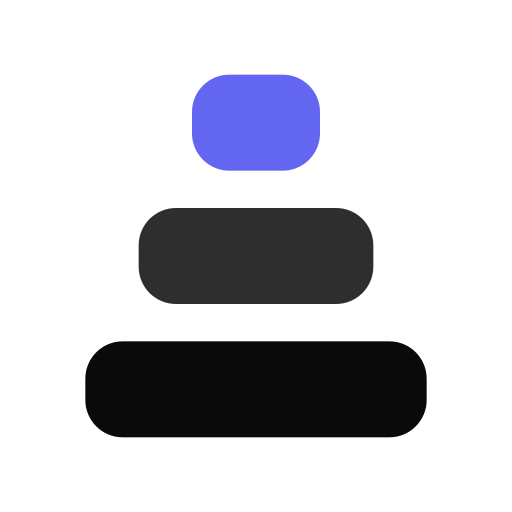
Ops Stack
Simplest to reproduce anywhere. Reads as a tower and as a dashboard chart at once, and survives being printed on a pen.
Single colour · favicon sizes

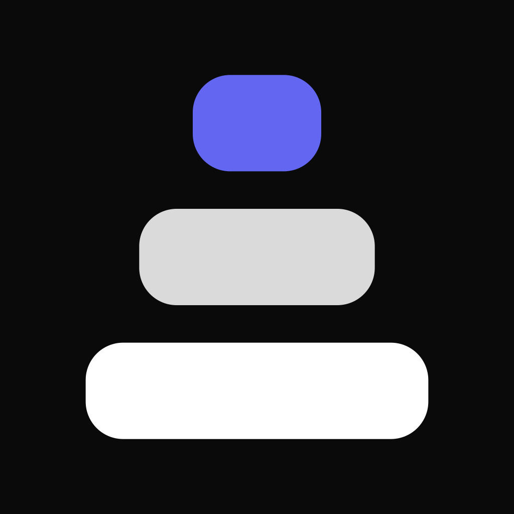

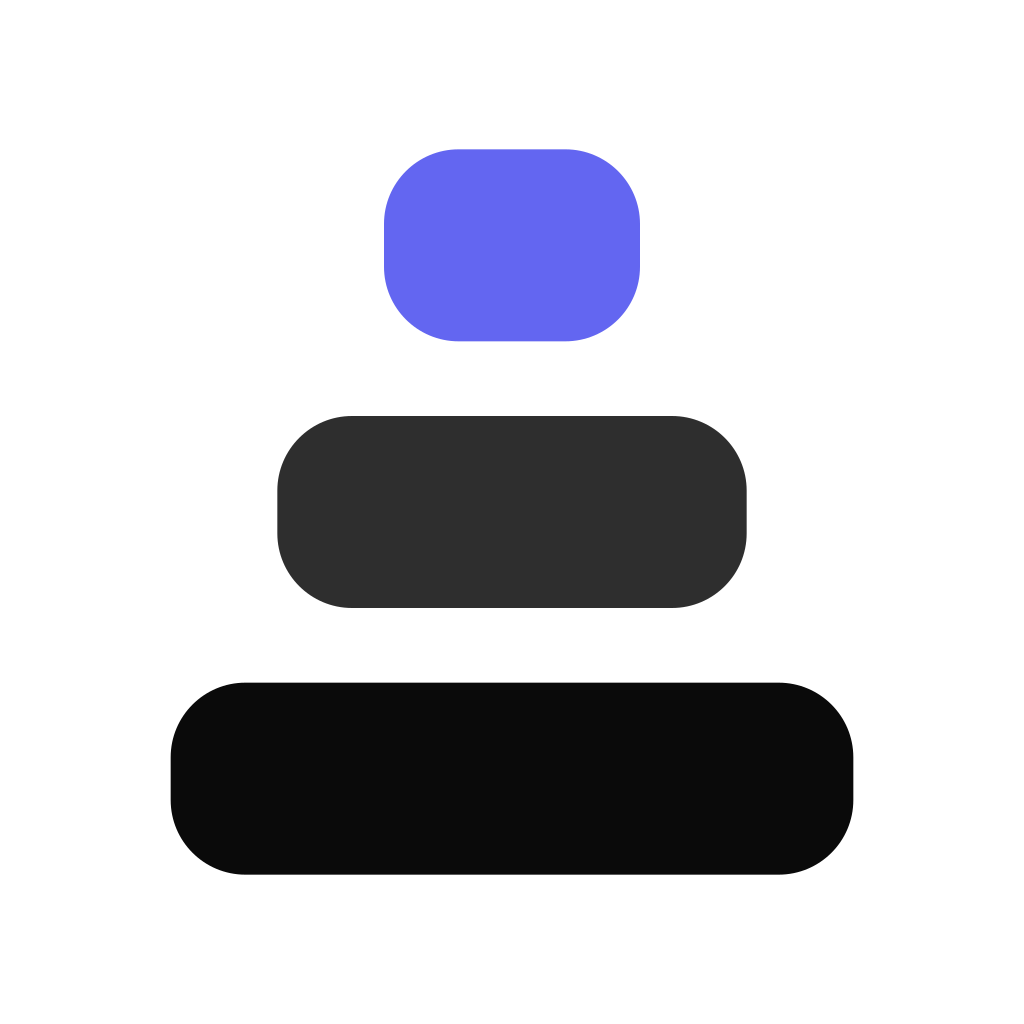

PNG is transparent. JPG can't be, so it ships flattened onto the background it was drawn for — use the matching one.
Beacon Tile
Purpose-built app icon and social avatar — solid tile, no transparency issues on any background.
Single colour · favicon sizes




PNG is transparent. JPG can't be, so it ships flattened onto the background it was drawn for — use the matching one.
Lockups
Horizontal for the site header and email signatures, stacked for social profiles and print. Clear space around the lockup should be at least the height of the tower base.








PNG is transparent. JPG can't be, so it ships flattened onto the background it was drawn for — use the matching one.
App icon & avatar
The solid tile avoids transparency problems on WhatsApp, Play Store, the App Store and social profiles.
Colour palette
Usage rules
Do
- • Keep clear space around the mark equal to the base height.
- • Use the white version on dark backgrounds, black on light.
- • Use the solid tile for avatars and app icons.
- • Convert the wordmark to outlines before sending to a printer.
Don't
- • Don't stretch, rotate or add drop shadows to the mark.
- • Don't recolour it outside the palette above.
- • Don't place the transparent mark on a busy photo.
- • Don't typeset the wordmark in a different font.